Vitest-Integrated! Conducting Next.js v16 Component Tests with Storybook Part 1 - Introduction & Basics -
Back to Top
To reach a broader audience, this article has been translated from Japanese.
You can find the original version here.
Introduction
#I am Tsukano from the Business Solutions Division at Mamezou. How do you conduct component tests during front-end development? I recently started exploring an open-source tool called Storybook.
Storybook is a service for creating UI catalogs. It allows you to render components in isolation from the main application and organize prop and state variations as “stories.” In addition to visual checks, you can also test component “behavior” involving user events such as clicks directly within Storybook. These behavior tests can use Vitest as the test runner, allowing you to run them together with your other Vitest unit tests.
Storybook supports various front-end frameworks. In this article, we’ll focus on introducing component testing in the popular Next.js framework. As of writing on February 18, 2026, the latest Storybook version is v10.2.7. There isn’t much consolidated information about this setup yet, so I’ll cover not only how to create component tests but also the setup steps with concrete examples.
This article became quite long, so I’ve split it into two parts. In Part 1—“Vitest-Integrated! Conducting Next.js v16 Component Tests with Storybook”—we’ll cover Storybook installation, basic usage, creating interaction tests, and running them with Vitest. In Part 2, we’ll discuss Next.js-specific built-in package mocking, App Router configuration, and module mocks.
Setting Up Storybook and Basic Usage
#First, install Storybook by running:
npm create storybook@latest
As of February 18, 2026, the latest Storybook version is v10.2.7. Storybook supports Next v16 from v10 onward (though some features are not yet supported; we’ll cover those in Part 2). The minimum required Next.js version is v14 or higher.
After running the command above, you’ll be asked “New to Storybook?”. Selecting “Yes” will scaffold a brief tutorial and sample story files. Choose as needed.
Next, you’ll see “What configuration should we install?”. Select “Recommended” to install the recommended setup. This option will add addons and create a Vitest configuration file for you.
Before writing stories, adjust the configuration files to match your project. Storybook’s configuration files live under the .storybook directory at the project root (see Configure Storybook | Storybook docs). With the Recommended setup, your .storybook directory looks like this:
/
└── .storybook
    ├── main.ts          # Storybook’s main configuration file
    ├── preview.ts       # Global styles and other settings
    └── vitest.setup.ts  # Vitest configuration for Storybook
Modify .storybook/main.ts as follows. If you chose the Recommended setup, these entries are added automatically; if you chose the Minimum setup, ensure @storybook/addon-vitest and @storybook/addon-docs are included under “addons.”
import type { StorybookConfig } from '@storybook/nextjs-vite';

const config: StorybookConfig = {
  "stories": [
    "../components/ui/**/*.stories.@(js|jsx|mjs|ts|tsx)"  // ← Edit to match your project structure
  ],
  "addons": [
    "@chromatic-com/storybook",
    "@storybook/addon-vitest",  // ← Required for running Vitest
    "@storybook/addon-a11y",
    "@storybook/addon-docs",    // ← Required for the Docs feature
    "@storybook/addon-onboarding"   // ← Tutorial addon; remove if not needed
  ],
  "framework": "@storybook/nextjs-vite",
  "staticDirs": [
    "../public"
  ]
};
export default config;
In the Storybook Config object, specify your story file paths in the stories field. Story files should use the .stories suffix, e.g. Button.stories.tsx. In this demo project, we place them alongside component files under components/ui. Adjust as needed for your project.
In Next.js projects, many use Tailwind CSS. To enable Tailwind in Storybook, import your globals.css in .storybook/preview.ts:
import type { Preview } from '@storybook/nextjs-vite'
import '../app/globals.css';  // ← Import globals.css

const preview: Preview = {
    parameters: {
    ...
    },
    tags: ["autodocs"],  // ← Enable automatic Docs generation for all stories
};

export default preview;
Storybook displays components in a UI canvas called the Canvas, but it actually runs inside an iframe called the “preview.” The preview.ts file configures this preview, allowing global settings for story rendering.
The Docs feature (discussed below) is very convenient, so let’s enable it for all stories by adding ["autodocs"] to the tags field of the Preview object. You can also enable Docs per story file.
With this in place, create a sample Button component under components/ui and write its story, then run Storybook. The component accepts size and variant props to switch between the primary and outline preset styles. Here, we use tailwind-variants to define these presets as variants. You can skim the code:
import React from "react";
import { tv, type VariantProps } from "tailwind-variants";

const buttonStyles = tv({
  base: "inline-flex items-center justify-center rounded-md font-semibold transition-colors focus-visible:outline focus-visible:outline-2 focus-visible:outline-offset-2 disabled:opacity-60 disabled:cursor-not-allowed",
  variants: {
    size: {
      small: "px-3 py-1.5 text-sm",
      medium: "px-4 py-2 text-base",
      large: "px-5 py-3 text-lg",
    },
    variant: {
      primary:
        "bg-blue-600 text-white border border-blue-600 hover:bg-blue-700 focus-visible:outline-blue-500",
      outline:
        "bg-white text-slate-900 border border-slate-300 hover:bg-slate-50 focus-visible:outline-slate-400",
    },
  },
  defaultVariants: {
    size: "medium",
    variant: "primary",
  },
});

type ButtonVariants = VariantProps<typeof buttonStyles>;

export type ButtonProps = Omit<
  React.ButtonHTMLAttributes<HTMLButtonElement>,
  "className"
> &
  ButtonVariants;

export const Button = ({
  size,
  variant,
  type = "button",
  children,
  ...props
}: ButtonProps) => {
  return (
    <button
      type={type}
      className={buttonStyles({ size, variant })}
      {...props}
    >
      {children}
    </button>
  );
};

export default Button;
Create the Button component’s story file like this:
import type { Meta, StoryObj } from "@storybook/nextjs-vite";
import { fn } from "storybook/test";

import { Button } from "./Button";

const meta = {
  title: "UI/Button",
  component: Button,
  parameters: { layout: "centered" },
  argTypes: {
    size: {
      control: { type: "inline-radio" },
      options: ["small", "medium", "large"],
      description: "Button size",
    },
    variant: {
      control: { type: "inline-radio" },
      options: ["primary", "outline"],
      description: "Button variant",
    },
  },
  args: {
    children: "Submit",
    size: "medium",
    variant: "primary",
    onClick: fn(),
  },
} satisfies Meta<typeof Button>;

export default meta;
type Story = StoryObj<typeof meta>;

export const Default: Story = {};

export const Outline: Story = {
  args: { variant: "outline", size: "large", children: "Cancel" },
};

export const Disabled: Story = {
  args: { disabled: true, children: "Disabled" },
};
You declare the component and its available props in the meta object and default-export it. Then derive the Story type from meta and create Story objects. Each Story object is rendered as a story in Storybook—the object name is the display name, and args defines the props passed to the component for that story.
Run Storybook:
npm run storybook
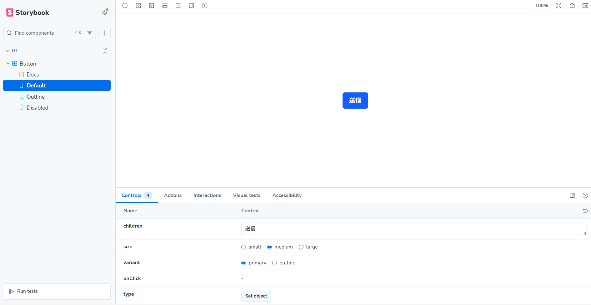
The Button component appears in the Canvas. In the “Controls” tab, you can adjust children and other props to see how the component looks and behaves.
The props shown in Controls are those passed via args. Since we defined args in the meta object, those are the defaults. You can also define prop details in argTypes. Even props not listed in args will appear in Controls if defined in argTypes.
You can configure how Controls are displayed. For example, control: { type: "inline-radio" } renders a set of radio buttons for union types (the default is a select box).
If you enable automatic Docs generation, a “Docs” tab appears in the sidebar. There you can see meta information and a list of all stories, giving an overview of your component.
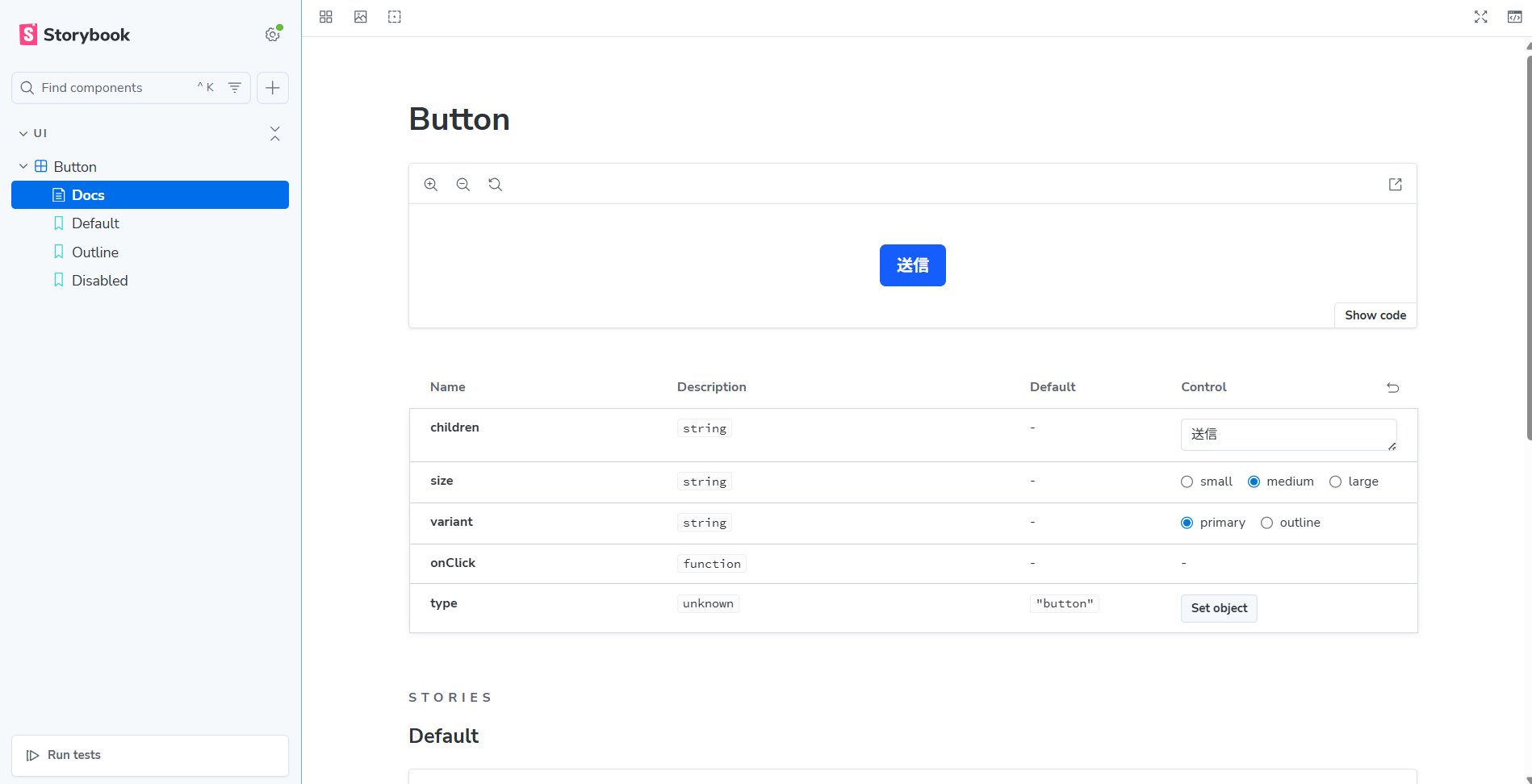
Component overview including props in the Button component’s Story Docs
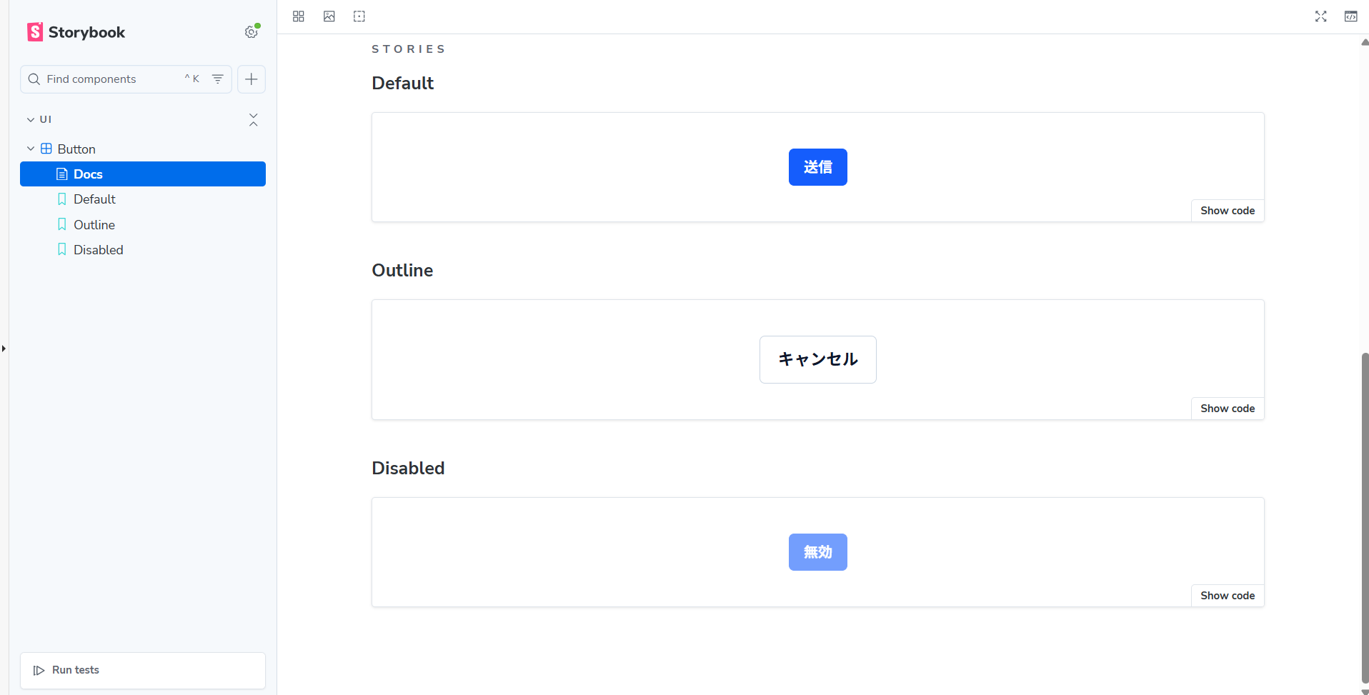
The Docs tab lists all created stories
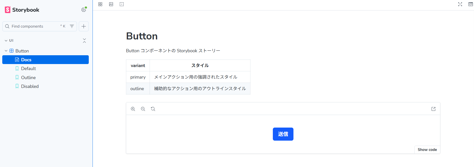
You can also write markdown in the Docs. If you include JSDoc comments in your story file, they’ll appear in Docs. JSDoc supports markdown:
...

/**
 * Storybook story for the Button component
 *
 * | variant | Style |
 * |---------|-------|
 * | primary | Emphasized style for main actions |
 * | outline | Outline style for secondary actions |
 */
const meta = {
  title: "UI/Button",
  component: Button,
  ...
}
...
So far, we’ve covered verifying a component’s “appearance.” Storybook can also test “behavior,” including user interactions like clicks.
Introducing Component Testing
#You can write behavior (interaction) tests for each story as a “play function.” (See Interaction tests | Storybook docs.) Let’s add a play function to our Button story to verify that clicking it calls onClick exactly once:
import type { Meta, StoryObj } from "@storybook/nextjs-vite";
import { expect, fn, userEvent, within } from "storybook/test"; // ← import from the package for interaction tests

import { Button } from "./Button";

const meta = {
  ... ,
  args: {
    children: "Submit",
    size: "medium",
    variant: "primary",
    onClick: fn(),  // ← pass the spy function fn() to onClick
  },
} satisfies Meta<typeof Button>;

export default meta;
type Story = StoryObj<typeof meta>;

...

/** Example play function: verify onClick is called once when the button is clicked */
export const ClickTest: Story = {
  args: { children: "Click Me!" },
  play: async ({ canvasElement, args }) => {
    const canvas = within(canvasElement);
    await userEvent.click(canvas.getByRole("button"));
    await expect(args.onClick).toHaveBeenCalledTimes(1);
  },
};
We added an interaction test story called “ClickTest.” Interaction tests are defined as async functions in the story’s play field.
To simulate user events and make assertions, use the functions and objects from the storybook/test package. Inside play, we:
- Get the Canvas.
- Find and click the
buttonelement within the Canvas. - Assert that
args.onClickwas called once.
Both userEvent and expect must be awaited.
For args.onClick, we passed fn() in the meta object. This is a Vitest spy function provided by the storybook/test package. When executed, it logs the event in Storybook’s Actions tab. (See Via storybook/test fn spies.)
Now view the ClickTest story and check the result. The test runs automatically when you open the story. Check the result in the Interactions tab:
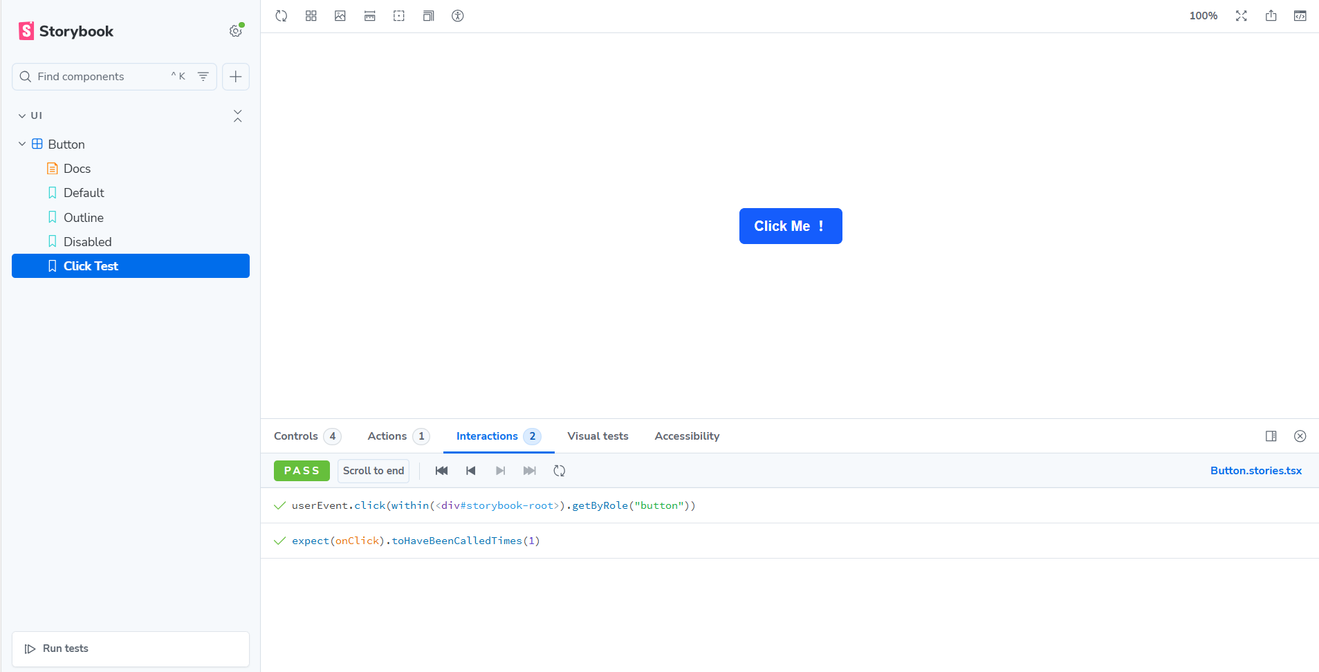
The test passed successfully. You can run all interaction tests at once from the Storybook UI by clicking “Run tests” at the bottom of the sidebar. Make sure “Interaction” is checked:
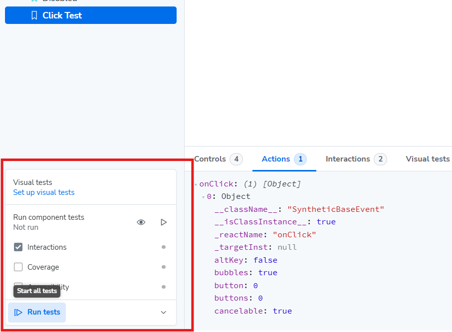
You can run all play functions at once via “Run tests” in the sidebar
Storybook uses Vite for its fast startup. However, launching Storybook and viewing results in the UI can be cumbersome when testing frequently. You may also want to run component tests in your CI pipeline alongside other unit tests.
Storybook provides a “Vitest addon” that lets you run interaction tests as Vitest tests on the CLI. (See Vitest addon | Storybook docs.)
This addon converts .stories files into tests that run in a headless browser and lets you execute them with the vitest command alongside your existing Vitest tests.
If you chose the “Recommended” setup when installing Storybook, Vitest-related configuration files (vitest.config.ts, .storybook/vitest.setup.ts) are created automatically:
import path from 'node:path';
import { fileURLToPath } from 'node:url';
import { defineConfig } from 'vitest/config';
import { storybookTest } from '@storybook/addon-vitest/vitest-plugin';
import { playwright } from '@vitest/browser-playwright';

const dirname =
  typeof __dirname !== 'undefined' ? __dirname : path.dirname(fileURLToPath(import.meta.url));

export default defineConfig({
  test: {
    projects: [
      {
        extends: true,
        plugins: [
          // ↓ Load the Storybook configuration file and target .stories files from the paths listed in main.ts for test execution
          storybookTest({ configDir: path.join(dirname, '.storybook') }),
        ],
        test: {
          name: 'storybook',
          browser: {
            enabled: true,
            headless: true,
            provider: playwright({}),
            instances: [{ browser: 'chromium' }],
          },
          setupFiles: ['.storybook/vitest.setup.ts'],
        },
      },
    ],
  },
});
import * as a11yAddonAnnotations from "@storybook/addon-a11y/preview";
import { setProjectAnnotations } from '@storybook/nextjs-vite';
import * as projectAnnotations from './preview';

// This is an important step to apply the right configuration when testing your stories.
// More info at: https://storybook.js.org/docs/api/portable-stories/portable-stories-vitest#setprojectannotations
setProjectAnnotations([a11yAddonAnnotations, projectAnnotations]);
In vitest.config.ts, a test project named “storybook” is added to target .stories files.
Create a separate Vitest project for .test and .spec files. This allows you to run only the Storybook tests when needed and distinguish them from function tests in the CLI by using project tags.
Finally, add scripts to your package.json:
{
  "scripts": {
    "test": "vitest",
    "test-storybook": "vitest --project=storybook"
  }
}
You can run only the Storybook tests with npm run test-storybook. To run all tests together, use npm run test:
$ npm run test

> storybook-demo@0.1.0 test
> vitest

 DEV  v4.0.18 /home/tsukano/storybook-demo/

3:02:47 PM [vite] (client) Re-optimizing dependencies because lockfile has changed
 ✓  storybook (chromium)  components/ui/Button.stories.tsx (4 tests) 501ms
   ✓ Default  357ms
   ✓ Outline 57ms
   ✓ Disabled 28ms
   ✓ Click Test 58ms

 Test Files  1 passed (1)
      Tests  4 passed (4)
   Start at  15:02:46
   Duration  3.84s (transform 0ms, setup 1.14s, import 49ms, tests 501ms, environment 0ms)
We can see that Vitest successfully picked up the .stories files and all tests passed. Since these tests run with Playwright, they take slightly longer than regular unit tests.
For integrating tests into your CI pipeline, refer to the official documentation. (See Testing in CI | Storybook docs.)
Conclusion
#In this article, we introduced setting up Storybook, basic usage, and running Vitest for interaction tests. We focused on local development; for deployment, please refer to the official documentation. (See Publish Storybook | Storybook docs.)
In the next article, we will cover Next.js-specific settings, mocking the router object, and module mocks.